

There’s a slight detail on the late Pontiff’s tomb that is causing much discussion in the world of graphic design. Source: Aleteia.
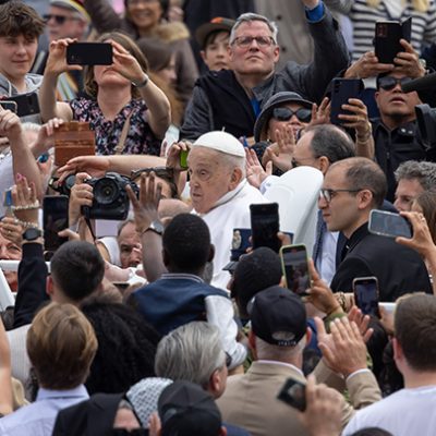
When images of Pope Francis’s simple tomb were released, a surprising controversy broke out – not over the humble stone that hearkens back to his Italian roots, or the lack of grandeur, but over something usually invisible: the kerning.
Kerning is the practice of adjusting the space between letters to make words readable and balanced. When done well, you don’t notice it. When done poorly – as many designers quickly pointed out – you can’t help but see it.
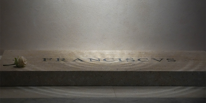
On the marble slab inscribed simply with “Franciscvs” (Latin for Francis), uneven spacing made it look more like “F R A NCISC VS,” prompting a minor design-world uproar.
Typography experts and calligraphers didn’t mince words. One called the lettering “horrifically bad,” another dubbed it a “rookie mistake,” as shared by Fast Company.
They noted that, rather than carefully adjusting each letter’s position, the engraver seemed to have spaced them mechanically, without considering how Roman capitals traditionally flow.
Yet amid the criticism, a different narrative emerged: perhaps the imperfection fits Pope Francis perfectly.
The tomb’s inscription consists solely of “FRANCISCVS.” There is no “P.P.” (Pontifex Primus) and no dates or epithets – just his name in Latin. This was a deliberate choice to avoid any hint of grandiosity.
The material of the tomb is a simple slab of slate from Liguria, the coastal Italian region where Francis’s grandparents came from. Church officials noted that this stone is not a prized Carrara marble or anything ornate – it’s commonly called la pietra del popolo (the people’s stone).
It’s also a subtle nod to one of his nicknames: “the People’s Pope”. In life, Francis was known for championing the poor and ordinary; in death, he rests beneath an ordinary people’s stone.
In this light, the tomb’s imperfect lettering becomes almost symbolic. The uneven kerning reminds us that Francis’s legacy was never about appearances or polish, but about authenticity, humility, and service.
FULL STORY